
It’s Called a “Bell Curve” for a Reason
Okay, against advice from blogger friends, I’m posting another brief lesson on statistics. This one has to do with the most basic shape in statistics. The bell curve.
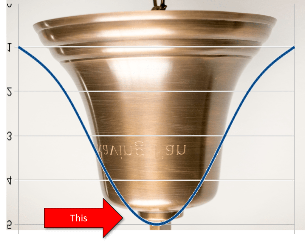
The bell curve is called a bell curve because it’s shaped like a bell.
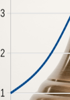
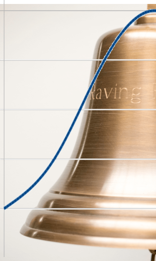
We use the bell curve because distributions usually end up looking like some variation of this shape when you plot them out. So folks who are trying to look at trends that rise and fall over time (cyclical trends), like illnesses for instance, make assumptions based on the shape of a bell curve. So when we see a population trend that does this…
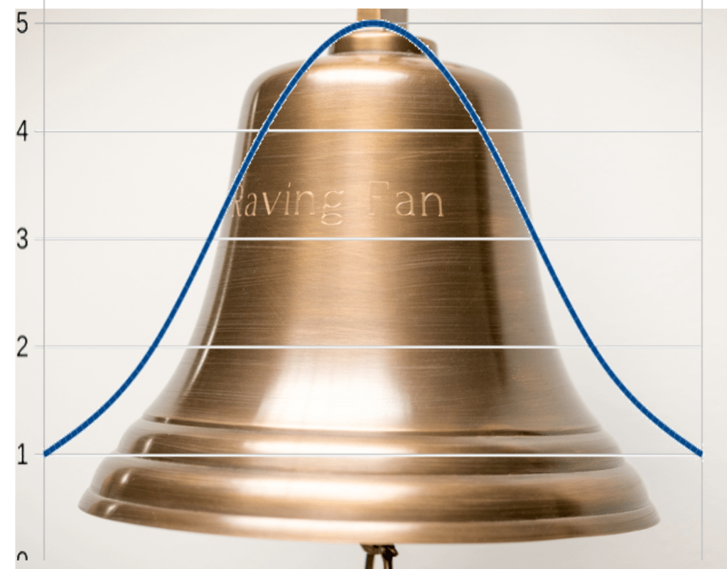
We predict that we will ultimately see this…

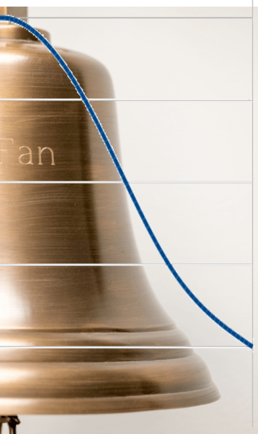
Now we may not know when we will get to the top part of the bell, or how wide the bell will be. The bell might even be skewed one way or the other…
But we can feel pretty confident that the shape will be bellish. Furthermore, the the more of the curve we see, the better predictions we can make. Ultimately, the goal is to find that top part of the curve.

That’s called the plateau, and once we see that plateau, we feel much better about our predictions, especially when that plateau starts to bend downward. Hurray!
But here’s the thing. It’s called a plateau because that’s the top part of the curve. It hasn’t gone down yet. So when you are looking at a bell curve of a pandemic illness, that area under the curve is the people who have contracted that illness. Reaching the plateau does not mean worry time is over let’s get back to business as usual. It means, you still have maybe half a bell to go.
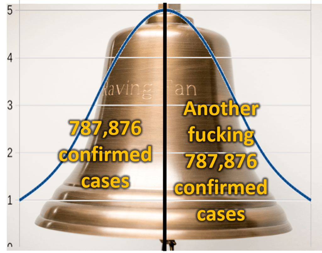
It’s like this…
So if we’ve reached the plateau and we’ve had, I don’t know, let’s say 787,876 confirmed cases, assuming a bell curve and assuming we are half-way across the plateau, we can predict this…
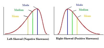
So look, it’s never that easy. Maybe the bell curve is left-skewed. In that case the number of cases will fall faster than predicted. If it’s right-skewed, like most of the people I’ve seen who can’t figure out a bell curve…it may fall off much slower. The bottom line is, before this illness troughs(1), we are looking at around 1.5 million cases. If we have seen 40,000 deaths by the time the plateau hits, and assuming nothing changes like better access to the necessary health care, then we can predict about 80,000 deaths before the bottom of the trough.
That’s how the bell curve works.
That’s why the goal is to flatten and left-skew the curve as much as possible…which can only be done using sound policy.
Furthermore, if it’s cyclical…and illness always are…the goal is to make sure we are prepared for the next upswing in the bell curve so we don’t have to deal with such a big freakin’ bell again. We deal with a little bell that’s much easier to handle.

Versus
Get the picture?
- A trough is the opposite of a plateau. It’s where the bell curve inverts. In cyclical trends, the trough eventually trends toward another increase.


Leave a comment